Nov 23, 2025
Back in 2023, we launched our redesigned Disney+ Hotstar Platform (now known as JioHotstar), and we wrote a short piece on how we made the redesign happen. But why did we take this big step, and were we able to reap any benefits?
Redesigning Disney+ Hotstar wasn’t just about revamping a product; it was about reimagining an entire experience.
Why Redesign?
In just over 5 years, between 2016 and 2021, Hotstar had rocketed to becoming the largest OTT app in India with over 140 Mn users and had made the Disney catalogue available to over 23 countries. In the rush to get to this size, a few things had to be compromised for valid reasons.
Customer Pain
When the app already has millions of users through content from the biggest storytellers in the world, one possible trade-off during growth is the bandwidth to solve for customer pain points within the product.
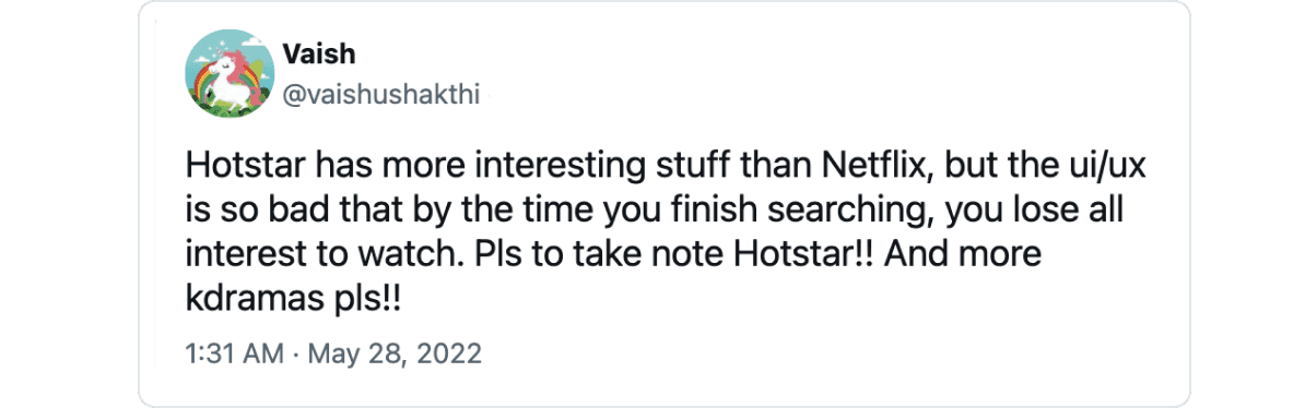
In a growth phase, certain features customers want might not have a high enough measurable impact, and quite rightly so, they don’t get prioritised, but customers would still feel the pain, and that doesn’t help with their perception of the product.
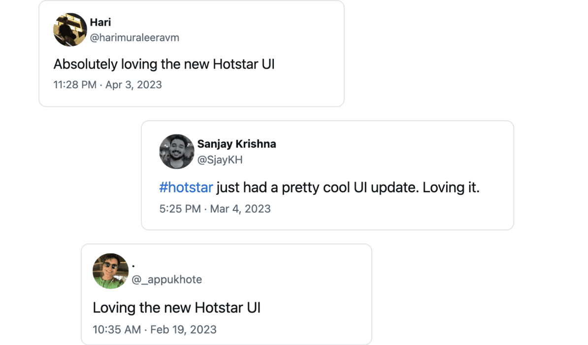
It was clear that we needed to improve the overall journey and introduce some much-needed features to change our customers' perceptions.
Though, why is a redesign needed to improve the journey and build features to fix customer pain points? This question brings us to our next reason about prioritisation.
Prioritising the Marbles
There’s a popular time management framework called “Big Rocks” by Stephen Covey. Imagine a glass jar representing the time you have to manage. You can fill this jar with big rocks (main priorities), small rocks (daily tasks), sand (less important tasks), and water (distractions). If you start filling the jar with small rocks, sand, and water, there won’t be enough space left for the big rocks — your main priorities.
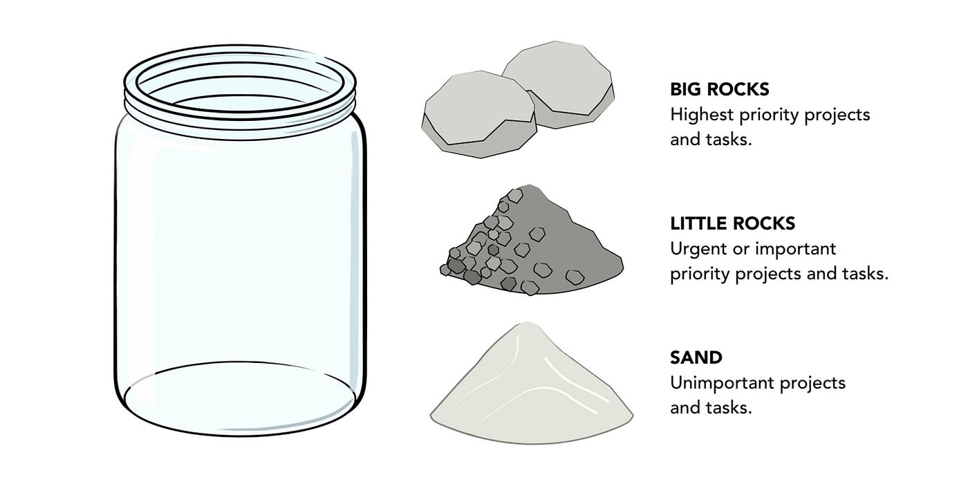
Most product companies, consciously or unconsciously, operate within this framework. So, what goes in as big rocks and small rocks first? You guessed it right — the measurable features that tie directly to business goals.
During prioritisation in a high-growth environment, the jar mostly filled up before we could add what I call “marbles,” which are design intricacies that elevate the user experience. These marbles will seem more shiny than functional to stakeholders. Over time, these accumulated into a long list we used to call design debt and were left to die there. Speaking of debt brings me to a debt in another part of the organisation.
Scalability and Speed
Keeping up with one of the fastest-growing apps was no easy task for the original platform, the outstanding engineering team had built over time, but the exponential growth meant that scalability and speed were compromised, as pointed out in this piece.
As the platforms evolved and the team size increased, there were new use-cases that couldn’t be optimised for and inconsistencies that cropped up over time. When inconsistencies creep up, there is one solution that design can help with, but we did not have: a design system.
In a country like India, where most of our customers use Android phones, building first for Android is a no-brainer, especially when you have limited resources and time during growth. So over time, the apps on each platform started to look drastically different, and most of the goodness didn’t make it beyond the Android app.
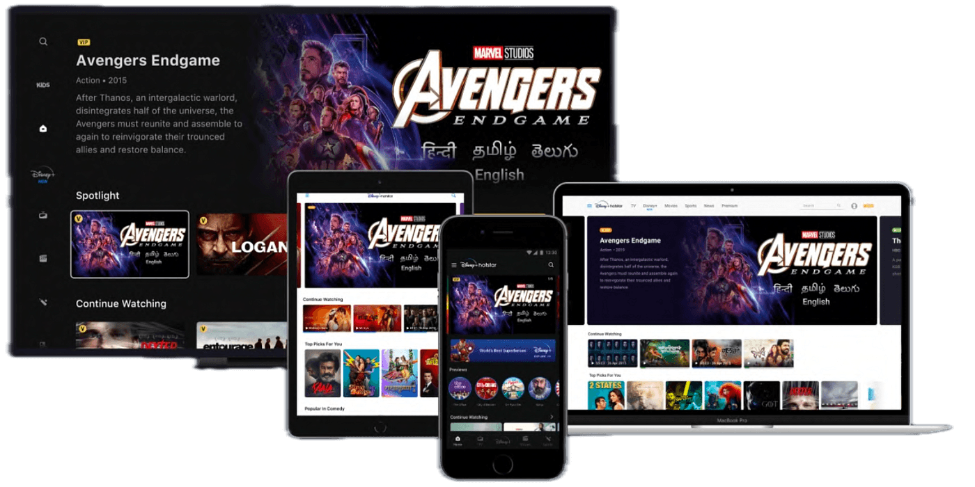
What we ended up with was fragmented experiences, which looked and felt different across platforms for the customer, and it was most often the case that they used different platforms at different times in their lifetime.
What We Redesigned
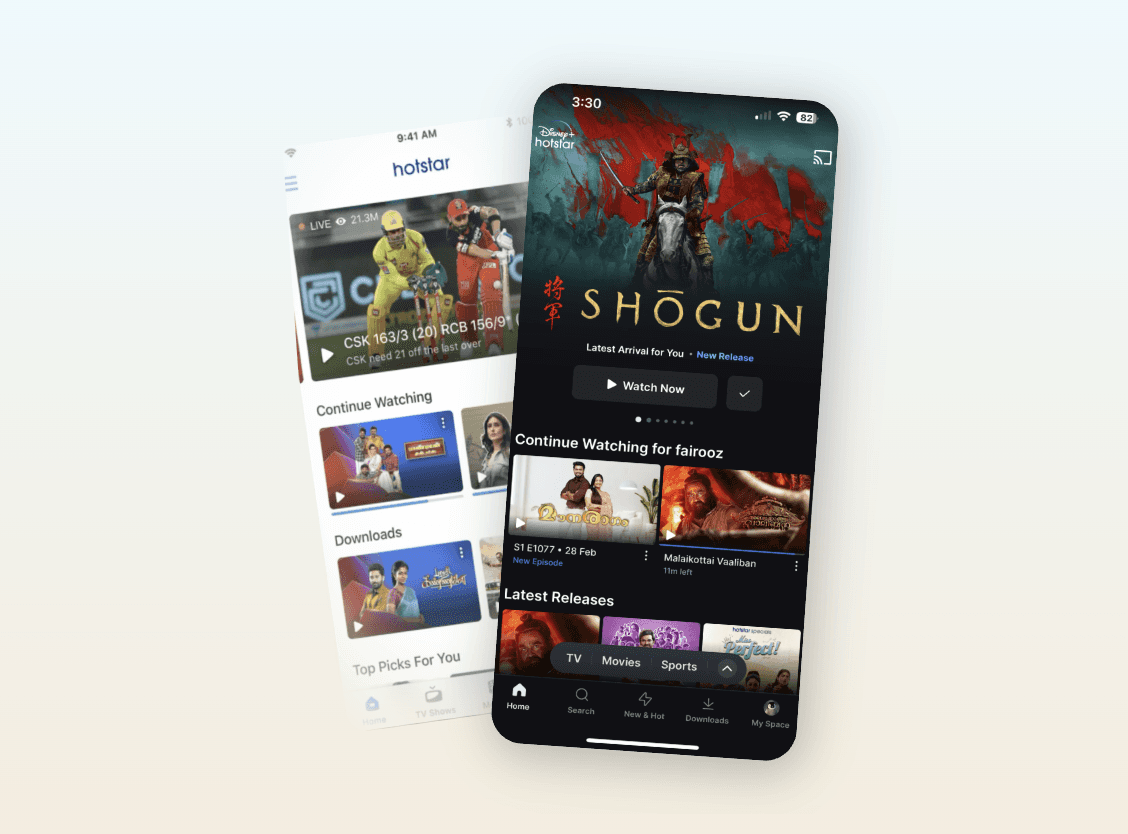
It was clear that we needed a major shake-up to solve these problems. So what did we do about it? We brought the magic to our customers.
At the heart of our redesign was a simple yet profound realisation:
Our users deserve a product that showcases the best exclusive stories and respects their time and effort.
Our north star for the redesign was to reduce the time to magic moment, the time it takes a customer to find something to watch.
1. Guide people in discovery
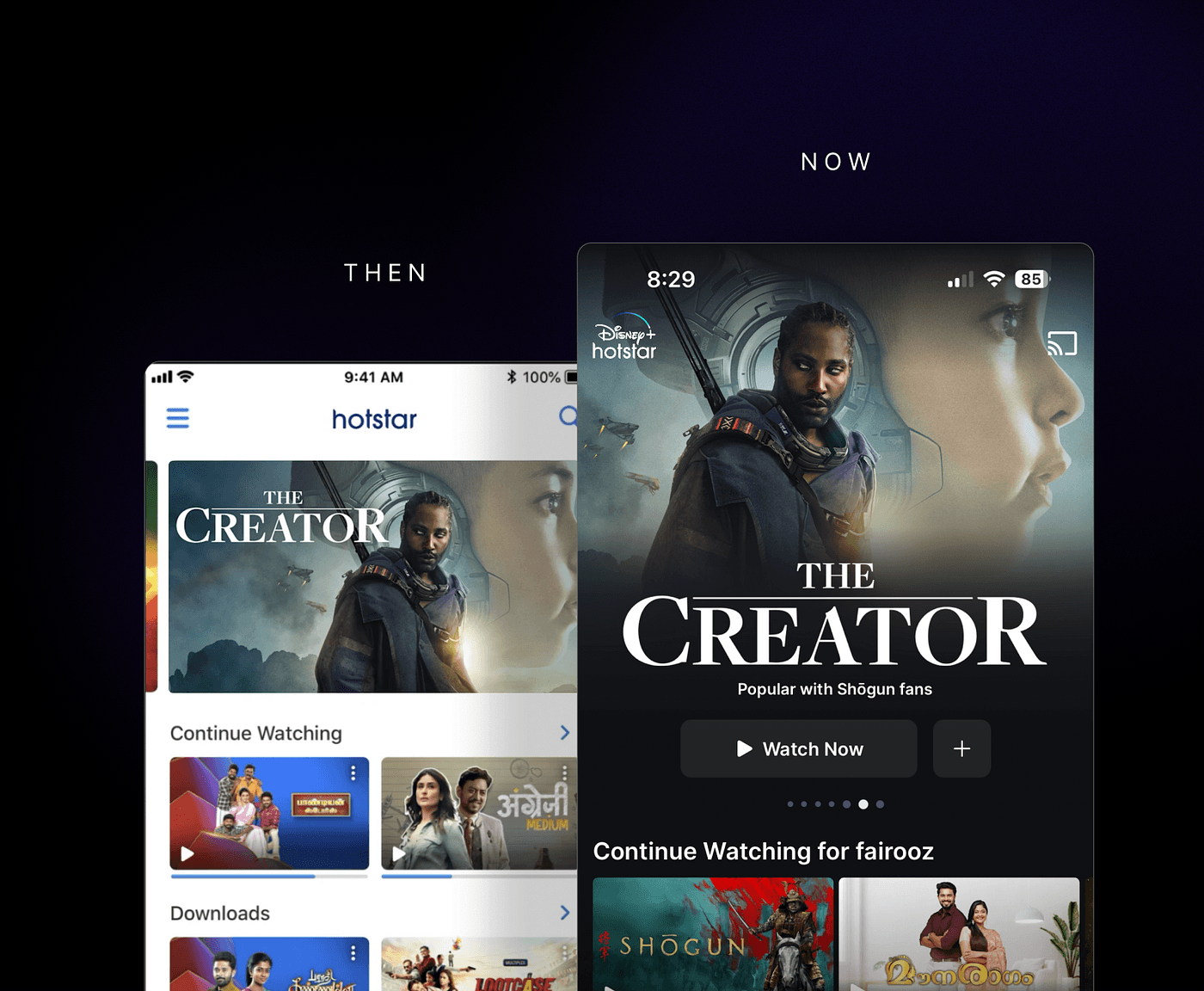
When deciding what to watch, people are now greeted with the top picks that made the content the hero and with an upfront action to guide them to the magic moment without compromising on our business goal to monetise advertisements.

2. Navigate based on the intent:
When you open the app with a specific intent, you could previously only browse by content types such as TV shows and movies, but now, everything they could want is within their fingertips and in one place.

3. Search faster with top results
When someone knows exactly what to watch, the search experience makes the most popular content hero, so as soon as you start typing for what you are looking for, the top result is up front and centre, reducing further typing, taps and scrolling.

4. One Place for Account Management
When someone wants to manage their account, instead of hoping to find it inside a hamburger menu, they can now go to their space and find everything about them, their account and their settings all in one place, removing any ambiguity.

5. Making it look and feel Magical
At some point in our product industry, visual redesigns to the product became considered impactless and something people don’t notice, but Patrick Collison of Stripe articulated the importance of beauty and craftsmanship quite well
“My intuition is that more of Stripe’s success than one would think is downstream of the fact that people like beautiful things — and for kind of rational reasons because what does a beautiful thing tell you? Well it tells you the person who made it really cared… And so if you care about the infrastructure being holistically good, indexing on the superficial characteristics that you can actually observe is not an irrational thing to do.”
Relevance is a key factor in entertainment, and our app needed to be updated in terms of visuals.
This was achieved with months of exploring until we fell off the metaphorical cliff to help us converge on a style that would make people feel immersed and blown away by the content.
To make it feel magical, we made the experience more fluid so that the app responded to not just every touch with life but also to every gesture with purpose

Animations are not just for delight, but also to let people know what they can do, like how we are letting them know what is free to watch here.

Magic with Soul
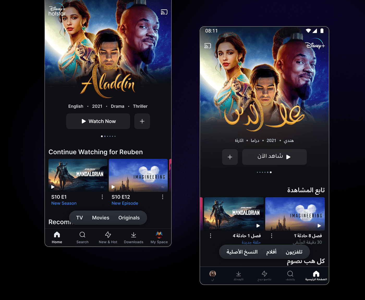
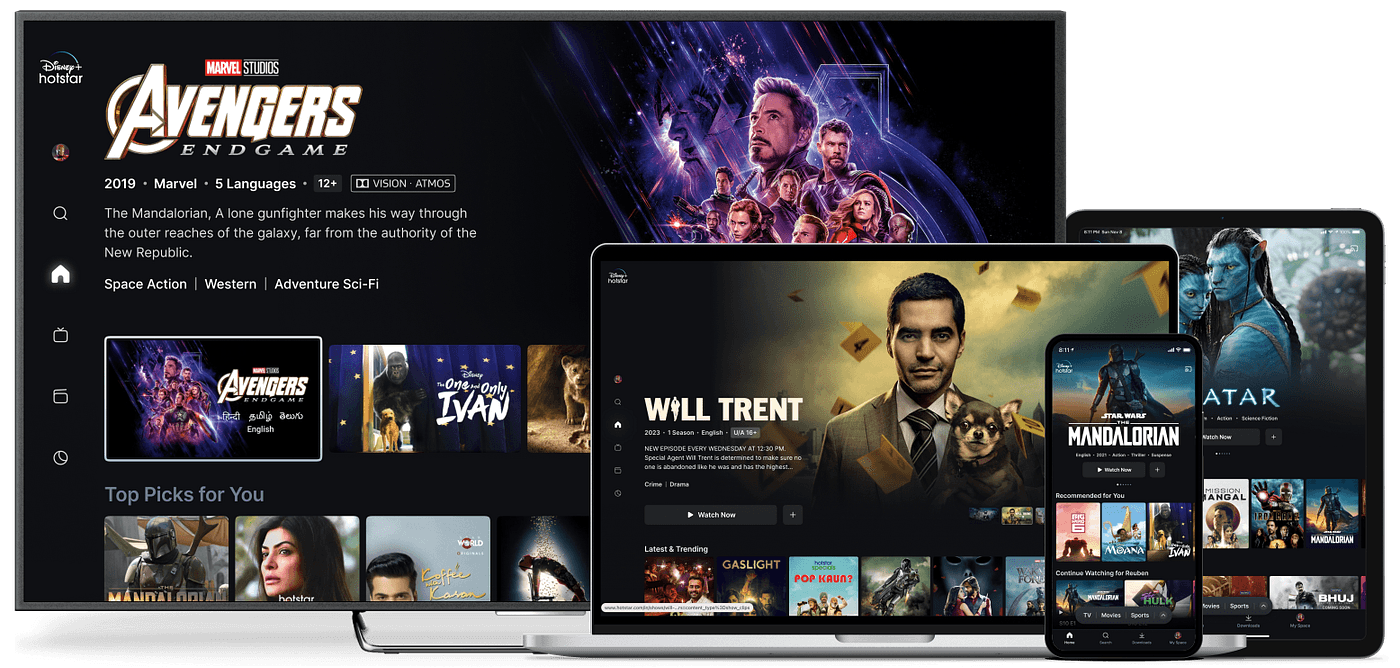
All this magic could not have been called magic if it hadn’t happened across platforms at an unexpectedly new pace and consistency. Our system, Soul Design, is the wand that brought this magic to life. It had to solve the gigantic challenge of being visually consistent across 8 platforms, 10 languages, and a literal mirror version of the UI for Middle East countries.
The Impact of the Redesign
A year after the rollout, we can now see the overall impact of the redesign. Some are measurable and others are not, but we see benefits that transcend metrics.
Customer Love
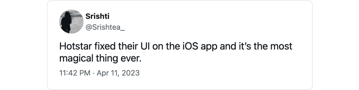
These changes reduced the time to magic moment by around 50%, which is the time it takes a user to find something to watch, and the users felt this smoothness. The love will flow in when you make the app easier to use.
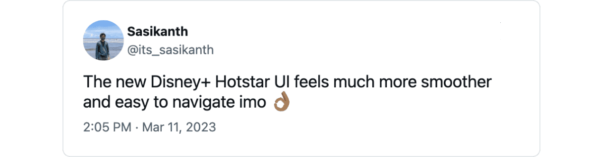
It was important that the users felt like this was the magical experience they deserved, and so the huge change of a redesign sparked a wave of positivity among our users, as they embraced the newfound care and attention to detail in every interaction.
At the end of the day, it should simply feel magical.
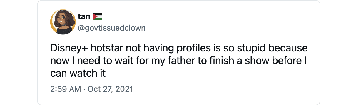
Prioritised Marbles
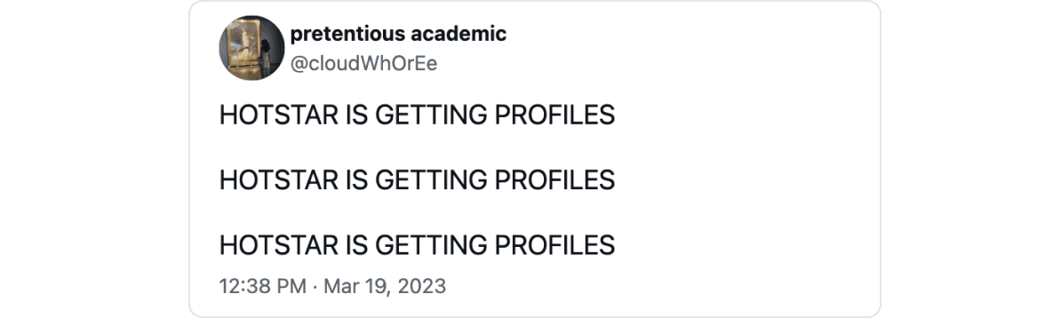
While on one hand, we used Hotstar X to improve the overall journey, on the other hand, we were also able to combine all those deprioritised marbles which were sitting as design debt into one giant beautiful rock called Hotstar X that got prioritised in one go.
This helped us bring much-wanted features, such as profiles to life through Hotstar X, and only our users can stress enough on how badly they wanted these features.
A Lean and Mean Launchpad
In Formula 1 motorsport racing, they change some of the rules and regulations every couple of years, and these change provides the motorsports teams an opportunity to redesign and rethink their car from the ground up. Whenever this happens, the whole team order changes, and a new competitor emerges as the dominant force.
Back to a less glamorous industry, there is no field leveller like F1 regulations change in business (except in Fintech in India), but the redesign and rebuilding across design and engineering helped us bring the Soul design system to life.
By leveraging Soul, we built features in a single year that would have otherwise taken 3 years to build since we were now able to reuse elements and deploy fixes instantly. For instance, when we had to do a branding change in the previous app and that took us around 2 weeks of design, development and QA effort. With Hotstar X, this can be done in a couple of days with minimal errors.
For a product company, saving 2 years across features is what makes it lean and mean.
Becoming one, everywhere
Hotstar X transcended these boundaries, delivering a unified experience across platforms and regions. Whether on Android, iOS, TV apps, or web platforms, everyone got the same experience since it was a complete redesign rolled out around the same time. So when people started using the redesign across platforms, they were greeted with the same new experience that spoke the same new language to them, but in a whole new upgraded suit.
Embracing the future
When we reflect on the impact of the redesign, it extends far beyond metrics and numbers. It impacted how our customers perceived our product, how we worked and what we worked on.
The Hotstar X redesign was more than just a facelift — it was a complete reimagining of how we deliver entertainment to millions of users across geographies. By focusing on user experience, consistency, and efficiency, we’ve not only improved our product but also set the stage for future innovations.